Yet to create a business website for your company? If so, the time to make the change is definitely now. Your business website serves as a critical hub for information and sales leads. Whether you are a local Los Angeles business or a fully online eCommerce operation, a business website is one of the most valuable investments. Businesses with a website, whether local or otherwise, build credibility, their brand presence, and new leads.

A business website is obviously valuable, but only when the site functions flawlessly. The best business website will be perfectly manageable, perfectly responsive, mobile friendly, giving your brand its own unique identity, highlighting your unique value proposition, using SEO strategies to keep traffic coming to you, and converting leads to sales.


Did you know that less than 64 percent of small businesses actually have a website? Even more concerning, 58 percent of small businesses intend to build a website of their own. Most will take the route of using a DIY platform that offers a website builder or template.
 Meet Our Team
 Meet Our Team
Websites start with understanding how people search and what they’re searching for. We identify key phrases, determine how often they’re Googled, and research how top competitors use that information in their pages. We also analyze competitor’s backlinks and page structure to understand why they’re coming out on top. The best business websites show first to the customer, so we don’t waste any opportunity to help you climb as quickly as possible. Bottom line: We find out what customers are searching for. We focus your content on top inquiries so you don’t miss out.

After refining our queries by categories, we integrate a semantic core that will drive traffic to the page. Website design has everything to do with how people understand a company or brand. If it’s unclear what a company does or the pages and content don’t have a logical flow, it will quickly cause visitors to lose interest. We ensure your URLs are loaded with the most popular search terms while highlighting searches with smaller volumes. This information will dictate how and where new content should be added to the site.
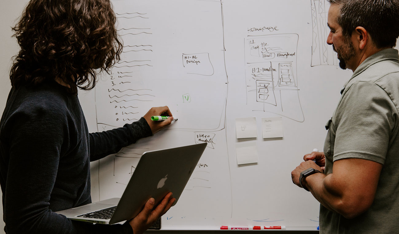
From design concept to content, samples let you quickly assess how the website creation process is coming along. We’re big fans of prototypes because they give clients a clear indication of how their brand is being portrayed and what information is being placed ‘above the fold’. We use the semantic core to customize pages and ensure visitors get the basic information at a glance. From there, they can scroll down to get additional details and answers to their questions. This is the best way to hook prospective customers, particularly those who are unfamiliar with a company. Once our client approves the prototype, we’re ready for the next step.
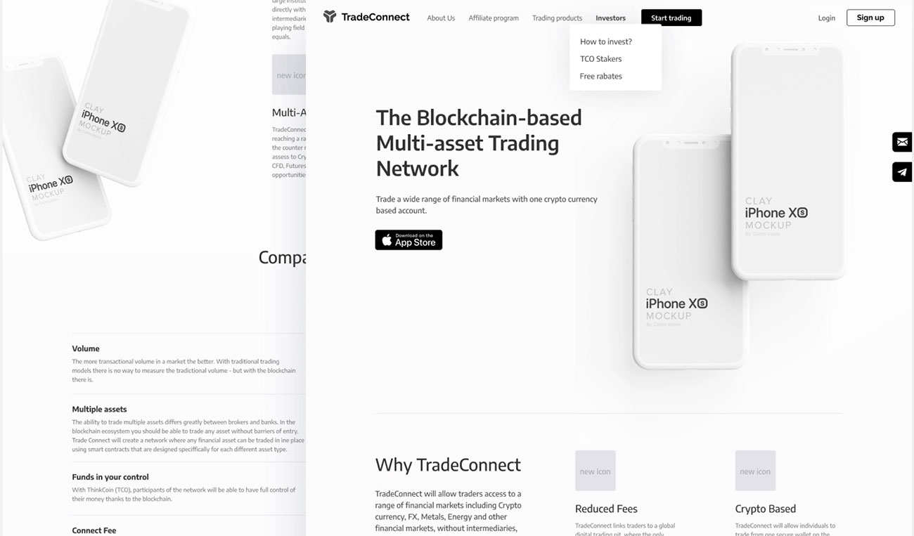
The visual elements of a website create a mood for the visitor. Our moodboards give the client a feel for what their future site will look like. Before diving into what color code to use or how large the graphics should be, we first consider the larger goals of the website as well as the demographic. We can also take into account different searching intentions as well. For instance, a toy retailer may want two different moodboards for kids or parents searching for products as opposed to serious collectors. It’s our goal to evoke the right emotions, so your visitors are motivated to take the next step.
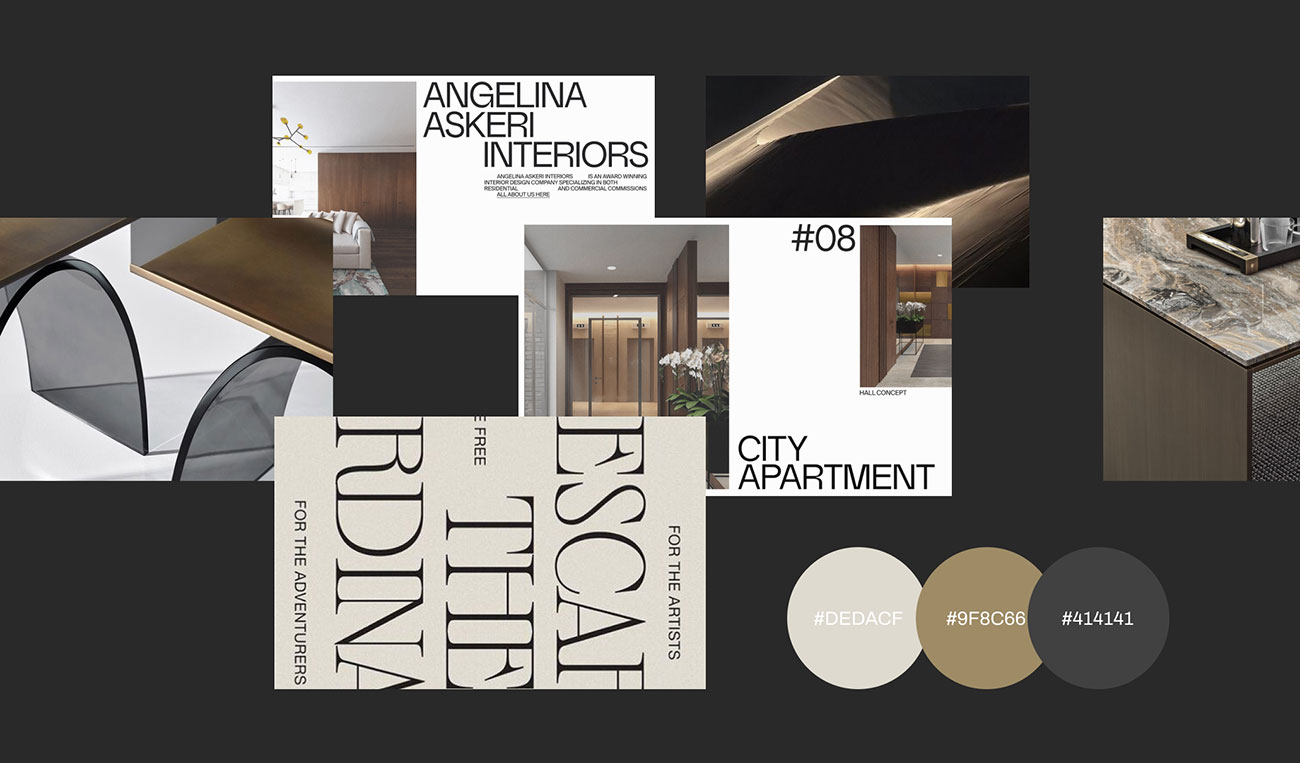
During this stage, we provide clients with 2 – 3 visual concepts for them to choose from. There’s an art to virtual design these days, particularly as the internet becomes more competitive. If websites are stodgy or otherwise appear unwelcoming, it doesn’t take much for visitors to move onto the next one. This is a chance to discuss whether the individual graphic elements are portraying the brand in the best possible light. It also gives everyone involved the chance to review key takeaways of visitors. Whether the site is supposed to inspire or reassure, the concepts can help narrow down the proper ways to send that message.
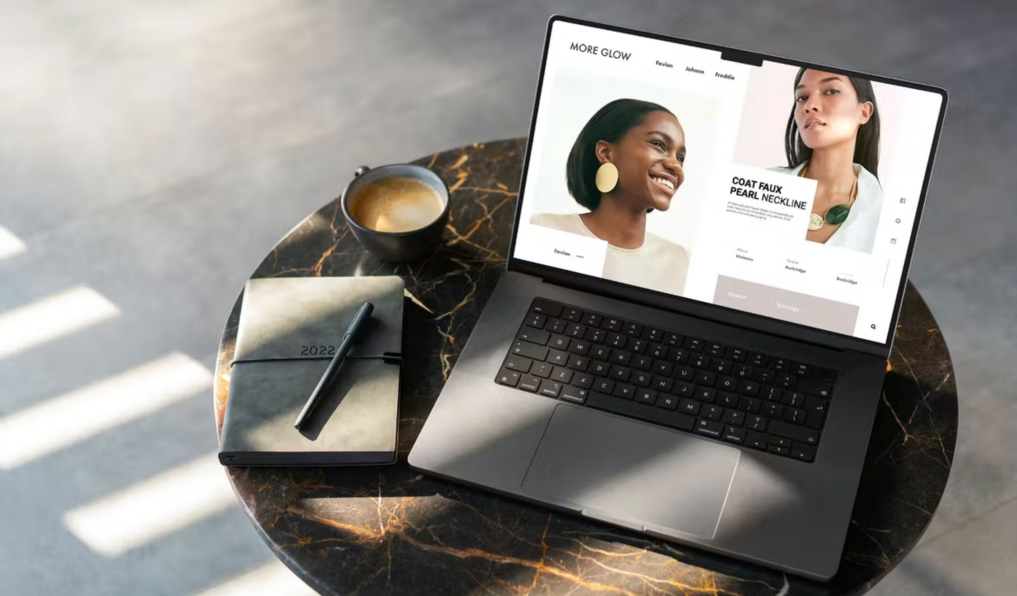
Once a client chooses a preferred concept, the mockup phase delivers a full view of what the site will look like. If you’re creating a website for your business, this brings all the above steps together to give you an idea of how your information is organized, how visuals appear, what font is being used, and whether the images are as clear on one device as they are on another. As clients comb through everything from the use of italics to the overall effects of the color scheme, they have a chance to make any last-minute changes to the final product.
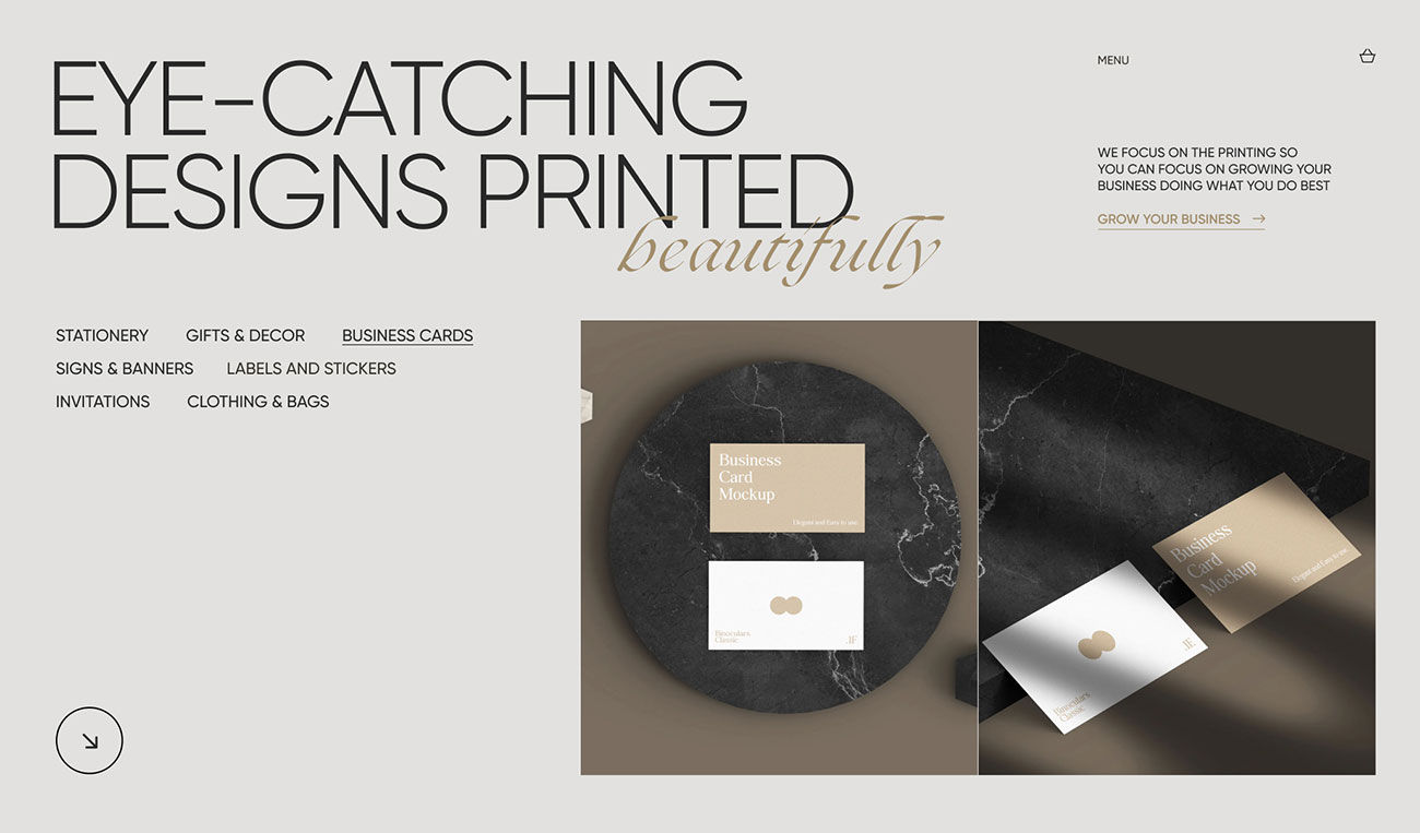
Front and backend development design the website so it’s functional for both man and machine. The backend ensures that the servers can interact with the data and the frontend ensures that all the client-facing elements are picture-perfect. Now is the time to work out any potential kinks for visitors, so you can be sure you’re interacting with as many customers as possible. We ensure load times are minimal and visitors can get from one step to the next without getting distracted or confused halfway through.

Content population refers to what your website is really saying. This isn’t as simple as copying and pasting onto a web page. (There are plenty of sites that make uploading information a snap, but that’s not where the real work is done.) This phase involves organizing, preparing, creating, and revising your content so that the message is clear. Before we upload anything, we take the time to really delve into what you’re saying to the visitor. Since content is still king — whether it’s video, images, or text — we aim to get as much information across as possible while still optimizing your page rank.

Internal links, descriptions, titles, indexing: there are a lot of technical details that make for better website design. All your buttons have to work and all your headlines have to be relevant. Functional business website design means your most important pages need to take priority in a Google search and any duplicate content needs to be purged. Titles have to be short with keywords, images have to be compressed without compromising quality. This phase adds sitemaps and robots that will ‘teach’ search engines how to crawl, index, and load your pages for the best possible rankings.
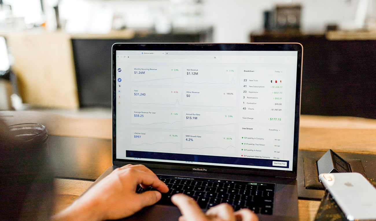
The final steps to create a business website include migration to the hosting provider, introducing the website for indexing, and testing for quality assurance along the way. No matter how people are searching for or what device they’re searching on, we ensure the launch goes as smoothly as possible. The early days of a website are critical to its success. If there are small issues at the beginning, we take care of them so they don’t turn into bigger problems.
